If your download did not automatically start. Please click here to download your file
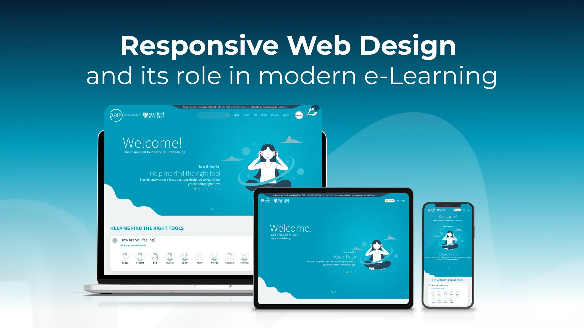
Responsive Web Design and Its Role in modern e-Learning
October 28, 2025
6
minutes
Save the Children
Explore other projects


%20%2B%2010%20(For%20EEI).png)

.png)


About the project
It is a long established fact that a reader will be distracted by the readable content of a page when looking at its layout. The point of using Lorem Ipsum is that it has a more-or-less normal distribution of letters, as opposed to using 'Content here, content here', making it look like readable English.
Video styles
Industries
Services
Our involvement
Concept and Scripting
Storyboarding
Commercial Production
Dedicated Project Manager
Dedicated Project Manager
Dedicated Project Manager
Storyboarding
Commercial Production
Dedicated Project Manager
Dedicated Project Manager
Dedicated Project Manager
Process walkthrough + Q&A
Typically takes 15 minutes
Typically takes 15 minutes
What Is Responsive Web Design and Why It Matters for E-Learning?
Did you know that 38.5% of users judge a business solely by the appearance of its website? While great content builds trust, an intuitive and responsive design is what creates the first impression, especially in e-learning environments where accessibility and engagement go hand in hand.
So, what makes a website look good and work well on all devices, be it a phone, tablet, or desktop? The answer lies in Responsive Web Design. It’s a web development approach that ensures a site adapts seamlessly across common screen sizes, offering consistent functionality and user experience.
This blog will explore responsive web design, how it works, and why it plays a critical role in delivering effective, scalable e-learning solutions in today’s digital-first world.
Understanding the Core Concepts of Responsive Web Design
To build websites that look great and function smoothly on various devices, one must understand the foundational principles of responsive web design. These concepts ensure that web pages render consistently across different screen sizes, especially for e-learning platforms where learners may use mobile phones, tablets, or desktops.

Fluid Grids and Flexible Layouts
At the heart of a responsive website lies a fluid grid system. Unlike traditional fixed layouts, fluid grids use relative units like percentages, em, or rem instead of fixed pixels. This allows the website layout to automatically adjust to the device width or browser size without breaking the structure.
Using flexible grids and layouts makes it easier to accommodate screen real estate differences between smaller devices and larger screens.
Media Queries and Breakpoints
Media queries are essential in adapting the design based on browser width or device type. They act like conditional rules that tell the browser how to style a page when certain conditions are met, such as when a screen reaches 768px (tablet) or 1024px (desktop).
Using multiple media queries helps create fluid websites and mobile-friendly designs that scale upward, ensuring the site looks polished on wide screens and small screens alike.
Flexible Images and Media
Large images can disrupt responsive pages on mobile devices. Setting a max-width of 100% with height auto makes fluid images and videos scale properly without distortion. This is crucial for mobile-optimized e-learning, where content must adapt fluidly to screen resolution.
The Viewport Meta Tag
The <meta name="viewport"> tag is a simple yet powerful HTML element. It controls how a web page is displayed on different devices by setting the initial scale and matching the viewport width to the device size. Without this tag, even a perfectly designed responsive site can appear zoomed out or distorted on mobile versions. It is one of the best practices followed by almost every web designer.
Why Responsive Web Design Matters in E-Learning?
Today’s learners are no longer tied to a single screen. From smartphones to tablets to desktop monitors, they expect seamless access to e-learning content anytime, anywhere. This shift has made responsive web design not just a technical requirement but a strategic advantage in digital learning environments.
So, why does responsive web design matter so much in the e-learning space? Let’s explore how it directly enhances accessibility, user experience, and learner outcomes across various devices.
Rise in Mobile Learning
More than 50% of global e-learning users access educational platforms through mobile devices. Additionally, the BYOD (Bring Your Own Device) culture is gaining momentum in corporate settings, enabling employees to learn at their own pace on personal devices. Without a mobile-responsive interface, learners may struggle to navigate or interact with content, reducing knowledge retention.
Consistent Learning Experience Across Devices
Responsive layouts automatically adapt to the screen size, whether it’s a 4-inch smartphone or a 15-inch laptop, ensuring the content remains readable and navigable. This flexibility improves content accessibility, especially for learners using older devices or varied screen resolutions. A consistent interface reduces confusion, making it easier for learners to focus on the material instead of the platform, one of the top techniques in e-learning practice today.
Better Engagement and Completion Rates
Sites designed responsively load faster and offer a smoother, more intuitive user interface, keeping learners engaged. In fact, according to a report by Google and SOASTA, 74% of users are more likely to return to a mobile-friendly site, which translates into better course completion rates and repeated interactions. For e-learning providers, this means higher satisfaction rates and increased learner retention.
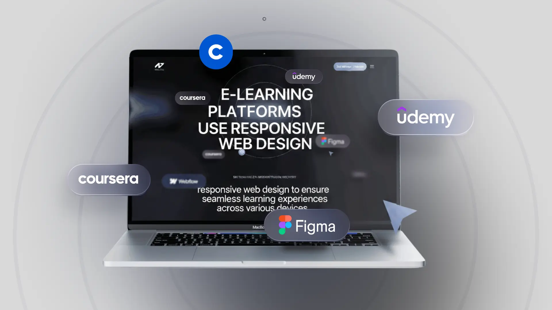
How E-Learning Platforms Use Responsive Web Design?
Leading e-learning platforms leverage responsive web design to ensure seamless learning experiences across various devices. The table below highlights how Coursera, LinkedIn Learning, and Udemy implement responsive features to cater to diverse device compatibilities.
Responsive Web Design Vs Adaptive Web Design
Many people often confuse responsive and adaptive web design, assuming they serve the same purpose in e-learning environments. While both aim to improve usability across devices, they differ in execution. Adaptive web design relies on predefined screen sizes and delivers different layouts for each, whereas responsive design uses fluid grids to adapt content seamlessly.
The following table covers some of the main differences between the two:
By understanding these differences, e-learning developers can choose the best approach based on project needs; though responsive design remains the more future-friendly option due to its device-agnostic behavior and ease of maintenance.

Why Responsive Design Is the Go-To for Corporate E-Learning?
With today’s workforce accessing training across devices and locations, responsive web design has become essential for corporate e-learning platforms. Its ability to scale efficiently and support dynamic learning environments makes it the preferred approach for modern businesses.
The following are some of the reasons why firms prefer a responsive design to provide corporate training to their employees:
- Scalability: Responsive design can seamlessly support thousands of users across various devices without the need for multiple versions of the course
- Future-proofing: As new screen sizes and devices enter the market, responsive layouts automatically adapt, ensuring your training remains accessible
- Lower development costs in the long run: Instead of building separate courses for desktops, tablets, and smartphones, a single responsive version reduces development and maintenance expenses
- Responsive Design Adjusts To Fit Any Screen: Layouts fluidly reorganize based on the screen resolution, offering an optimal viewing experience for every employee, whether they’re on a laptop or a mobile phone
- Allows Learners To Enjoy The Course On Any Device: Flexibility leads to higher course engagement and completion rates as learners can access training on their preferred devices
- Course Customization: Features such as scalable media, adaptive font sizes, and interactive elements make it easier to personalize courses for varied corporate learning needs
Common Mistakes to Avoid in Responsive Design for E-Learning
While responsive web design enhances flexibility and accessibility in e-learning platforms, certain design oversights can hinder its effectiveness. Avoiding these common mistakes ensures a smoother learning experience across all devices.
- Not using the viewport meta tag: Without this tag, browsers won’t adjust layouts properly on mobile screens, causing display and scaling issues
- Ignoring vertical orientation: Many learners use smartphones in portrait mode. Designs that don’t account for vertical orientation often break or become hard to navigate
- Poor contrast or unreadable font size on smaller screens: Small text and low contrast reduce readability, especially on smartphones, frustrating users and lowering engagement
- Not optimizing for different screen resolutions and devices: A one-size-fits-all approach won’t work. Responsive design must be tested across various resolutions to maintain consistency
- Designing only for desktop versions: Prioritizing desktop layouts alone can alienate mobile users. A mobile-first approach ensures broader accessibility and user satisfaction
Why Responsive Web Design Is No Longer Optional?
Responsive web design is no longer just a design preference, it’s a core requirement for delivering effective corporate e-learning experiences. In today’s multi-device world, learners expect seamless access to training content, whether they’re using a desktop at work or a smartphone on the move.
A responsive learning environment ensures your training is not only accessible and engaging but also scalable across different screen sizes. This adaptability boosts learner satisfaction and extends the reach of your program.
By enhancing usability and catering to mobile-first behaviors, responsive design ultimately helps maximize ROI on your e-learning investments.
Ready to future-proof your training program? Explore our e-learning solutions and see how we can help you design for impact.